Tracking Kanban with TFS
January 25, 2013
Kanban is a great way to manage your bug backlog. It’s much better than Scrum simply because of the nature of bugs as compared to user stories. Scrum is all about making firm commitments based on estimates but bugs are very hard to estimate up-front. Generally when you’ve looked hard enough into the code to find the problem, you are in a position to fix it very quickly. Bug fixing is essentially a research task - like a spike - so time-boxing the work makes much more sense.
Set up a prioritised backlog and blast off the top as many bugs as possible in the time you’ve set aside - Kanban Style. This works very well but, as with most agile approaches, it leaves old fashioned managers a bit grumpy. They want to track your productivity and it’s fair to say that you should too because that’s how you spot impediments (plus it’s always good to show off).
Scrum-style burn downs don’t work with Kanban because they track progress against some committed target. The answer is the Cumulative Flow Diagram:
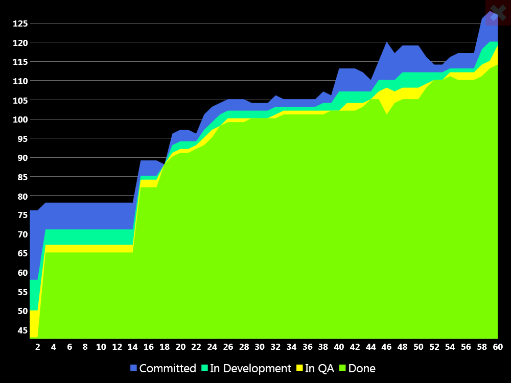
So I did some tweaking to my Information Radiator to add a page showing the CFD for the last 60 days of one of our projects. The data comes out of TFS via the C# API and a WIQL query - which has a very nice historical query feature which I’ll explain below.
Cumulative Flow Diagrams Explained
Cumulative flow diagrams couldn’t be simpler. Like a burn-up chart they show a running total of the bugs fixed over time. Since bugs aren’t estimated, the Y axis shows the bug count. In the chart above the X axis is in days but I guess you could do weeks or even hours if you like. In addition to the “fixed bugs” series, there are also stacked series for other states: “committed”, “in development” and “in QA”.
The benefit of showing the other issue states is that it gives you a readout on how the process is working. The QA and development series should generally be the same thickness. If the QA area gets fatter than the development area then you have a bottleneck in QA. If the development series gets too fat then you’re spread too thinly - you have an impediment in development or need to think about your Kanban limit.
Note how there are a couple of “steps” on the left of my graph. Those correspond to the first couple of sprints in which we used TFS. The team weren’t familiar with it, so work item states were generally changed at the end of the sprint. As time went on we got better at updating the system and the steps turned into a nice looking slope.
Historical Queries in TFS 2012
It’s not every day that I openly applaud Microsoft for doing something brilliant and until now I’ve never been that cheerful about TFS. But… the historical querying in WIQL (work item query language) is bloody brilliant!
Drawing a CFD chart depends on an ability to get the historical state of any issue in the system at a specified point in time. In WIQL this is done using the “AsOf” keyword:
[sourcecode]
Select [ID], [Title], [Effort - Microsoft Visual Studio Scrum 2_0], [Assigned To]
From WorkItems
Where
[Team Project] = ‘Project’
And
[Work Item Type] = ‘Bug’
And
[Iteration Path] under ‘Project\Release’
AsOf ‘21/01/2013’
[/sourcecode]
So the algorithm for drawing the CFD is pretty simple:
- Grab the sprints for the project in question and use them to get the start and end dates for your chart
- For each day on the X axis
- Run a WIQL statement to get the state of all the bugs in the project on that date
- Use linq to count issues in the various states you're showing on the graph series
- Populate a list of view model/data objects (one for each X value)
- Throw the values at the chart