World's Simplest Data Model?
December 5, 2022

Talking about the weather
A couple of weeks ago I wrote a post about a very simple data pipeline which pulls weather data from the Met Office and stores it in an S3 bucket, where I can query it with Athena. The source API is a bit unreliable (as is my code!) and the resulting data is filled with duplicates, anomalies and missing values. It’s a pain in the backside to use!
In this post I want to talk about the next component of my “World’s Simplest Data Platform”: Data Modelling. I’ll demo a basic ETL to deduplicate and clean the source data, define a simple table structure, and briefly show some ideas for data quality solutions and how to apply them in real life.
The demo is available on my github if you’d like to see the code, but really my aim is to discuss some core concepts of managing data, building ETLs and making the most of your data assets.
Models
Data modelling is often seen as part of the wider discipline of Data Engineering. I prefer to see it as a unique business function in and of itself, concerned with the design, build and management of data as an asset. While data platform engineers typically concern themselves with platforms, tooling and integrations, data modelling engineers busy themselves with the structure, governance and presentation of data. These two areas overlap, no doubt, but they have very different success factors and motivations. Good data modelling is all about:
- Creating a digital replica of the world to answer questions about it.
- The compounding value of joining related concepts - having all your data in one place.
- Making data digestible, understandable and easy to interact with.
- Treating data which relates human beings with the respect it deserves; keeping secrets.
Some may be expecting this post to be about technology - specific tools like Snowflake, BigQuery, DataBricks or key concepts like Data Lakes, Pipelines, Warehouses or just good old-fashioned relational databases. I think the choice of tools is very important, but it’s also very specific to you and your business. In this post I’d rather focus on the core principals that are relevant regardless of the tech you choose.
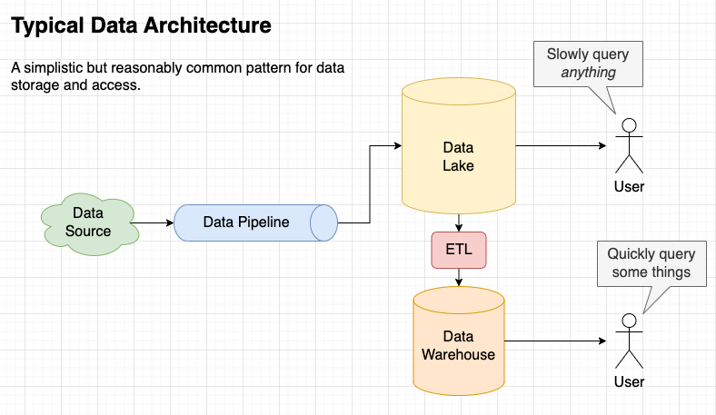
Above is a sketch of what I’ve built for my demo. It’s deliberately simple, using serverless, free-tier tools in my personal AWS account. There are all sorts of sensible reasons why a real-life data platform would be more complex than this, so forgive me if this looks different to what you’re used to.

Weather Data Model
As I mentioned, the dataset we get from the ingest job is difficult to use and the obvious place to start is to:
- Remove duplicated rows
- Resolve issues with erroneous data
- Re-partition by event time (as opposed to receive time)
- Add some summary tables for quick insights
On a philosophical level, we’re also changing the purpose of the data as we move it into a structured model. The purpose of the ingest pipeline is just to “store everything” - that means we can save it pretty much in the format we receive it, with a schema that corresponds to the source system. Meanwhile, modelled tables should be designed for us. We should transform the data into a structure that reflects our own business and processes, enabling users to interact with data in a very natural and familiar way.
As engineers, we also need to think about the balance of accuracy versus timeliness in the data models. Do users need the data to arrive within minutes or can they wait until tomorrow? Do they need 100% accuracy or is it enough to be “mostly right”? Think of the people balancing the books in your Finance department, who want every penny accounted for, versus the people in marketing, who want to create new audiences and personalisations to respond to real world events ASAP.
In this demo I am doing an overnight process, which will rebuild the entire table every morning at 6am. This is perhaps the simplest possible tactic for dealing with late arriving data, duplication and so on. It also has the benefit that any changes made to the ETL (data quality checks, changes to calculations etc) are reflected across the whole dataset first thing next day. If you process billions of rows every day, this might not be a viable solution for you, but for this demo it works wonderfully.

Removing duplicated rows
One thing we know about the ingest pipeline which loads this data is that it can and does create duplicate rows. This is common in real world ingest systems too - where “at least once” delivery is the de-facto standard for resilience. Better to get the message twice than not to get it at all.
So, the main job of our ETL is to take the data from the source, in the dantelore.data.incoming bucket, remove duplicates
and store the results in dantelore.data.lake, ready for (fictional) users to query. This is pretty easy to do with a
SQL statement, especially now Athena supports insert into statements.
insert into lake.weather
select
    observation_ts,
    site_id,
    site_name,
    site_country,
    ...
    dew_point,
    obs_year as year,
    obs_month as month
from
(
    select
        observation_ts,
        site_id,
        site_name,
        site_country,
        ...
        dew_point,
        month(observation_ts) as obs_month,
        year(observation_ts) as obs_year,
        ROW_NUMBER() over (
                partition by date_trunc('hour', observation_ts), site_id
                order by observation_ts desc
            ) as rn
    from weather
)
where rn = 1
The clever bit of this statement is the partition logic, which ensures we take only the first reading for any given hour. Note
that we’re using the observation_ts to do this, not the year and month partition columns. Our source data is
partitioned based on the date it was received but that’s of little use in our modelled table. So we switch over to
partitioning on event time. We can do this easily here because we know we are regenerating the whole table each day, so
any late arriving data will be pulled into the appropriate partition on the next ETL run.
It’s worth noting that in a real life system, SQL might not be the right answer for developing an ETL. You might use something like DBT, Spark or an ELT process within a scalable warehouse platform like Snowflake or RedShift Spectrum.
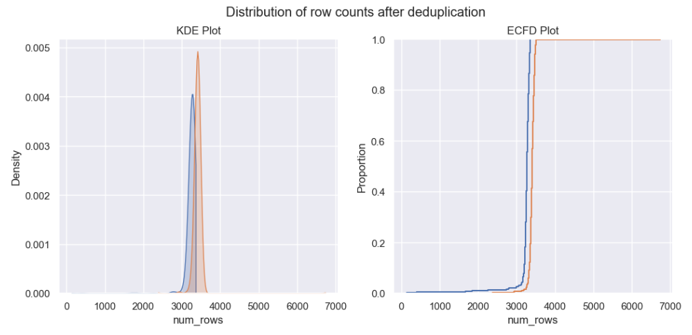
You can see from the chart below how deduplication impacts the number of rows in the dataset for a given hour. No doubt it’s looking much better now.
Duplicated data dealt with, it’s time to look for any other quality issues in the data…
Finding and fixing errors manually
One of the simplest ways to find anomalies in data is to visualise it. So, I created this chart to look at min and max temperatures in the raw weather data.
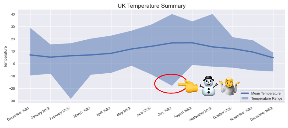
There is something fishy going on here with the minimum temperatures. Most obviously for July at -18°C (it simply does not get that cold in the UK in Summer) but also in February 2022 (-28°C is way colder than you’d expect to see). Looking at the Met Office’s own summary for July 2022, we can see that the official minimum temperature for the month was 2.3°C
| min_temp | max_temp | mean_temp | month | |
|---|---|---|---|---|
| 1 | -8.2 | 15.7 | 5.2 | January 2022 |
| 2 | -28.6 | 16.6 | 6.3 | February 2022 |
| 3 | -9.0 | 20.4 | 7.0 | March 2022 |
| … | … | … | … | … |
| 5 | -1.8 | 26.8 | 11.8 | May 2022 |
| 7 | -18.0 | 40.2 | 16.7 | July 2022 |
| 8 | -1.1 | 34.3 | 16.8 | August 2022 |
| 9 | -2.5 | 40.3 | 13.5 | September 2022 |
Another query revealed that these unusually cold readings were recorded by the weather station at RMB Chivenor, home of the Comando Logistics Regiment of the Royal Marines and, more importantly from the point of view of this data, on the relatively warm North Devon coast.
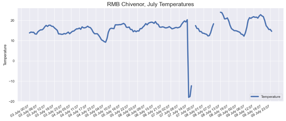
Looking into the data for Chivenor, you can see there was some kind of problem around the 7th July, with a couple of very low readings, followed by some nulls. Now we’ve found these dodgy values, we can take steps to filter them out when we create our modelled data table or to flag the rows for users of our data. Which tactic we choose here depends on our use-case.
The easiest way to exclude the bad data is in the SQL statement we created to build our model. This might seem crude and simplistic at first glance (and maybe it is!), but it has the benefit of being simple, explicit and tracked in version control - and those things are good things.
where year <> '2022' and month <> '7' and site_name <> 'CHIVENOR' or temperature > 0 -- exclude broken readings from Chivenor
WOW! This was hard work though, wasn’t it? Finding these issues manually is possible, but it’s very time-consuming.
Dealing with missing data
The final data quality issue in our weather dataset is missing data. It seems that weather stations suffer outages, undergo maintenance and so on. This means missing data is unavoidable.
What we can do here, and might also choose to do in real life, is clearly document the fact that data might be missing. We can flag the sites with the best and worst reliability and so on. If you can’t make the data perfect, the best course of action is to very clearly communicate what consumers can realistically expect to find when they use it.
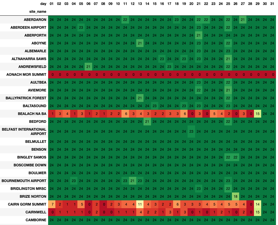
In the table above, taken from this notebook we can see a visualisation of the data loaded for a given month this year. As a user, you can see at a glance the quality of the data - which in turn will influence the way you use it. If you see a table in the data lake called “weather” you might assume it is a complete record of weather in the UK, but a quick glance at the notebook shows that’s not the case!
Visualising data quality like this also helps engineering teams to find and fix bugs. I can imagine the story of an engineer climbing to the summit of a peak in the Cairngorms to turn something off and on again on 29th. You can see the fix clearly in the chart above. They didn’t manage to get to the summit of Aonach Mor yet though. You can also see a more transient bug or outage that happened on 25th, where a large number of sites lost a couple of hours worth of data. That was more likely an error in the data ingest pipeline - something we should look into soon perhaps.

A summary table and the importance of definitions
As well as storing a clean and complete model of the incoming data, in many real world scenarios it also makes sense to create a suite of summary tables, which are smaller and more targeted to a particular business application or use-case. For example imagine we’re using this data to examine long term trends in UK weather. We want to be able to quickly access temperature readings for different locations, on a month by month basis.
Here’s some SQL to compile such a summary…
insert into lake.weather_monthly_site_summary (
    site_id, site_name, lat, lon, year, month, low_temp, high_temp, median_temp
)
select
    site_id,
    site_name,
    lat,
    lon,
    YEAR(observation_ts) as obs_year,
    MONTH(observation_ts) as obs_month,
    approx_percentile(temperature, 0.05) as low_temp,
    approx_percentile(temperature, 0.95) as high_temp,
    approx_percentile(temperature, 0.50) as median_temp
from lake.weather
group by site_id, site_name, lat, lon, YEAR(observation_ts), MONTH(observation_ts)
It’s not unusual for a summary table like this to encapsulate some business logic. In this example, low_temp and high_temp are using the 5th and 95th percentile, rather than the min and max values for temperature. There
are all sorts of sensible reasons for this - if you’re interested in trends, you might well exclude outliers and corner cases and so on.
The important thing to do when implementing this kind of logic is to very clearly document what’s going on. There’s a real risk that a new user of this summary table, maybe picking it up two or three years down the road, would make incorrect assumptions about the values in these two fields. If you were asked to find the lowest temperature recorded in the UK you might do something like select min(low_temp) from lake.weather_monthly_site_summary and this would of course be wrong. Now imagine if this was a critical business metric like revenue, unique users, purchase price and the same mistake was made…
There are many ways to document this kind of thing, and I’d advise you to use all of them! You can manually create docs on your wiki, you can make the code available to users of the data, you can use a proper data catalogue to
allow users to explore your schema, and so on. One of the simplest ways to make the business logic clear though is to just give the fields sensible names, so high_temp becomes temp_at_95th_percentile. Users might be slightly
annoyed that they have to type a few more characters when running a query, but they will be much less likely to misunderstand the field. Self documenting schemas are very valuable!

Data Drift
Because the nature of incoming data is to change over time, it’s hard specify in advance all checks, measures and special cases you might see over the next few months or years. Thinking about our weather data, we’ve already seen that sites have outages and send invalid values. We know sites will be decomissioned in future and that new ones will come online. Maybe the data feed will change and new measures will be added, data types changed or the relational constraints altered. Even macro-level influences like climate change mean that range checks we might build today would be invalid in a few years time.
So I’d suggest that it’s better to capture, store and visualise data about your data than in is to try and handle errors internally. Users will trust your model all the more if they can see a selection of charts and metrics which show the health of the data at a glance.
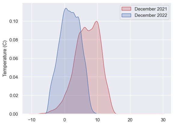
The KDE plot below shows temperatures this December vs the same month last year. You can see we’ve recorded much lower temps this year and that seems pretty normal. However, there’s enough in this basic chart to prompt some thinking - to validate that yes, this December was a cold one; to confirm a pattern an analyst spotted elsewhere and so on. Imagine a similar plot showing order values, bank balance, transaction counts and hopefully you can see the value of producing metadata like this alongside your models.
Giving humans the ability to visualise data quality is incredibly valuable. The next step of course is to automate these quality checks - monitoring metadata and raising the alarm when things don’t look right. There are some excellent tools on the market to do just this: Great Expectations which I have used and redata and datafold which I’d love to dive deeper into one day.

In Summary
That’s been a very long post, and if you made it this far - thank you! We’ve barely scratched the surface of the exciting and underappreciated world of Data Modelling, but I hope that by going back to basics like this I have illustrated what I believe are the key considerations:
- High quality, curated models are well worth investing in. Dumping a pile of raw, untransformed data into your data lake makes it possible to do analytics, reporting and so on. Having a proper data model makes it fun.
- Your aim should be to help your users find the answers they want by providing a well designed model of your domain. The constraints in your schema should match constraints in the real world. Your model should help quantify not just what happened, but the rules and processes behind the numbers.
- Handle quality issues explicitly. Ensure that the code for your ETL and the data assets it creates are kept in strict lockstep through versioning, release and the software lifecycle.
- Summary tables are wonderful for encoding use-case specific business logic in a centralised and well-documented way. Create lots of them! Don’t be worried about duplication in the data and don’t try to make one table work for every possible situation.
- Visualising and monitoring the volume, accuracy and statistical properties of your data will help build trust with users. Share these things openly.
If you’d like to read more ‘back to basics’ content, why not check out this post on data ingest or this one on building a data strategy. If you fancy something a bit more unusual, here’s a post on face clustering.