World's Simplest Headless BI?
March 31, 2026
This chart uses live data from my personal data lake!
This is the story of how I made it happen.
Uncharted territory
It’s been a journey…
A few years ago I wrote a blog called “World’s Simplest Data Pipeline?” in which I tried to demonstrate the core principles of data engineering using the smallest, least complex setup I could build. Little more than an AWS lambda function in fact.
A month later I followed up with another post called “World’s Simplest Data Model?”, in which I explained what I believe are the key considerations when transforming ‘raw’ external datasets into usable, clean production data - the kind you might put in a data lake. Then I moved on to other things.
Four years later I realised that these simple little tools had been running faithfully in the background, costing no more than a few pence each month, filling my small personal data lake with weather data of remarkable quality. There was a hiccup in late 2025 when the UK Met Office closed down the original data source and I had to move to a new one, but other than that, these small and mighty pipelines have performed flawlessly.

By way of a celebration, a couple of weeks ago I used Claude (who wasn’t even a twinkle in Dario Amodei’s eye when I started loading the original data) to crank-out some more pipelines to load a selection of UK energy data. The constraints of the system and the simple pattern I was using led to an unbelievably productive experience - I found myself able to research, load, backfill and quality control an entire dataset in less than an hour. I might blog about this one day too - and time will tell if these AI-authored pipelines are as solid as the one I wrote myself.
But data is worthless if you can’t show it to someone. What’s the point having five years of weather data in your data lake if you can only view it via a SQL console? I needed a way to display the data here on my web page, but I just couldn’t think of a way to do it that was cheap and effective enough.
Until now!
Headless BI
So Business Intelligence (BI) tools have been around for donkey’s ages. Tableau, Power BI, Looker and the like allow users to pull together data from a bunch of different sources and use it to create beautiful charts and graphs. Charts and graphs which make their bosses look good in meetings and, sometimes, guide business decisions with data and insights.
Though powerful, these tools are expensive. I have a total budget of $0 for this project (and most others to be honest) so I needed a free solution. Jupyter Notebooks and Streamlit offer a great free option - with Streamlit in particular being amazing for internal dashboards and data-driven tooling - but they are very difficult to embed in a web page like this one.
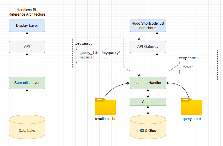
What I need here is a Headless BI solution. These tools became popular over the last 5 years, focusing on separation of the “Semantic Layer” (the definition of metrics, consistent querying, joining, filtering etc) with the “Presentation Layer” (the bit that draws the graph). Headless BI solutions tend to be API-based, giving data engineers tools to define relationships and metrics while farming out the user interface to other tools.
Some popular headless BI tools include Cube and GoodData. I actually use Cube at work and highly recommend it to anyone looking to add a customer-facing front end to their data lake, or build big data enabled products. Most of these tools are open source, so we’re OK there… but… they also need a server to run - which would mean paying AWS for an EC2 instance I cannot afford.

Do it yourself
So we inevitably find ourselves here - with me explaining that I built the smallest, cheapest, simplest headless BI solution. To prove it works, here’s a chart of UK temperatures for 2024, pulled direct from my data lake!
Here’s how I implemented each of the key components of headless BI. Remember that the aim here is to create the world’s simplest, not build a product fit for anyone other than me!
- Presentation Layer: My website is based on hugo, so I added a bunch of hugo shortcodes for this; with vanilla javascript, CSS and ECharts for rendering the graphs. Entirely feasible to switch this presentation layer out for something completely different if needed, which is a key design principle of headless BI.
- API: we use an AWS lambda function as the “brains” of the query engine. It sits behind a pretty standard API gateway setup to allow POST of query requests and GET for results data. The API provides decoupling between the BI engine and the front end.
- Semantic Layer: key component of headless BI which allows centralised definition of metrics and domain modelling decoupled from presentation. We do this here through a library of SQL query files, stored in S3 and accessed by name. All calculations can be done in these files, so when ‘median temperature over time’ is requested, the same result is returned regardless of who asked.
- Query Layer: Athena is used for queries, as well as a basic caching system for faster response.
A bit more detail
I added a bunch of different chart types. Here’s a frequency curve showing the difference in temperature distributions for March in two different years.
Presentation layer
Here’s the code in the hugo markdown for this page. As you can see, it’s pretty self-explanatory. Some global settings for size, title and so on as well as a couple of series definitions for the red and blue plots.
The key thing to note is the query parameter. This is what allows the lambda function to map this request to a specific query SQL file, stored in the back end.
{{< chart-histogram
    id="uk-temperature-distribution"
    query="uk_temperature_distribution"
    title="UK Temperature Distribution: March 2023 vs 2026"
    x="bucket_start"
    x_label="Temperature (C)"
    y_label="Observations"
    height="300px"
    x_min="-5"
    x_max="14"
    bucket_size="0.5"
>}}
[
  {"field": "mar_2023", "name": "March 2023", "type": "line", "color": "#1d4ea0", "area_color": "rgba(84,112,198,0.25)"},
  {"field": "mar_2026", "name": "March 2026", "type": "line", "color": "#a02020", "area_color": "rgba(238,102,102,0.25)"}
]
{{< /chart-histogram >}}
Semantic layer
So when the lambda function receives the request it does two things. First it checks the cache to see whether results already exist for this query_id with these parameters. If no cached results exist, it goes on to find the appropriate query SQL file then loads and executes it.
All the semantic detail is wrapped in the SQL. How we aggregate, calculations for key metrics, joins and so on. All the logic to map from our data model in S3/Glue to simple series of numeric data is contained in the SQL file. Here’s what it looks like:
WITH bucketed AS (
    SELECT
        year AS yr,
        FLOOR(temperature / CAST(':bucket_size' AS DOUBLE)) * CAST(':bucket_size' AS DOUBLE) AS bucket_start
    FROM lake.weather
    WHERE (year = 2023 OR year = 2026)
      AND month = 3
      AND temperature IS NOT NULL
),
counts AS (
    SELECT yr, bucket_start, COUNT(*) AS cnt
    FROM bucketed
    GROUP BY yr, bucket_start
)
SELECT
    bucket_start,
    MAX(CASE WHEN yr = 2023 THEN cnt ELSE 0 END) AS mar_2023,
    MAX(CASE WHEN yr = 2026 THEN cnt ELSE 0 END) AS mar_2026
FROM counts
GROUP BY bucket_start
ORDER BY bucket_start
What’s missing?
The system I’ve presented here works really well for my personal blog - and likely for future personal projects too. The ability to pull data out of my data lake and show it in great looking graphs with minimal code and almost zero cost is incredibly powerful…
…but this is by no means a fully featured Headless BI tool. The most obvious missing piece of the puzzle is globally consistent metric definition. Yes, the SQL files enable consistency, but the onus is on the developer (me!) to make sure all the SQL files implement everything the same way. Real Headless BI systems allow centralised definition of metrics, which can be used multiple times across many queries.
Likewise, complete headless BI systems offer a bunch of usability features like schema awareness, dimension catalogues, dynamic query generation and so on. With the system presented here, I am committing myself to a lifetime of SQL authoring. My personal antidote to this is AI assistance!
Given that I am a solo developer, working on personal projects, I actually prefer simple, code-centric solutions over complex “helpful” features which are hard to build and maintain. When I built the “World’s Simplest Data Pipeline” I felt the same - I want the maximum data flow for the minimum in code and infrastructure complexity.
Maybe though, in the age of AI, as Claude Code sits in a tab to the right of everything I do, my coding preferences are becoming more relevant to other, more complex scenarios. When you have an AI to help you write the SQL based on nothing more than a simple description and a schema document, perhaps you don’t need the helpful query tools at all?
Perhaps simple, neat, low ceremony patterns like those I have presented here are all we need these days?
Or perhaps not. I certainly won’t be recommending that my team at work moves away from Cube any time soon!
So if all this project turns out to be is a neat example of the principles of a core Data technology, then so be it. Until next time, farewell!

Bonus material: Energy charts!
I teased at having loaded some energy data, so here are some example charts based on that data - all using the World’s Simplest Headless BI…